


Orange-yellows made from PY110 have many possible names, including Isoindolinone Yellow Deep (Holbein, shown) and Permanent Yellow Deep (Daniel Smith). For this post I originally went with the Schmincke name, Yellow Orange, because it’s simple, descriptive, and easy to spell; but I switched to the complicated Holbein name because it is the most unique and difficult to confuse with other colors. Plus, I now use the term ‘Orange Yellow‘ to mean an entire category of colors, so it was confusing.
Anyway, this is one of them. This color exists in the liminal space somewhere between a deep, orange-toned (warm) yellow and a light, yellow-toned orange.
Pigment Stats
Pigment Number: PY110
Names: Isoindolinone Yellow Deep (HO), Permanent Yellow Deep (DS), Yellow Orange (SH)
Chemical name: Tetrachholo-isoindolinone
Invented in: 1946
Lightfastness: ASTM I (Excellent)
Toxicity: Nontoxic
Transparency: Transparent
Staining: Yes
Granulating: No
Observations of Holbein’s Isoindolinone Yellow Deep

Gradient: In mass, it’s a fiery yellow-orange, and diffuses to a warm glow. Glazes to a pumpkiny orange.
Opacity: Looks 100% transparent to me.
Glazing: Achieves a very vibrant orange in glazing.
Comparison to Other Brands
Daniel Smith – Permanent Yellow Deep

Daniel Smith’s Permanent Yellow Deep is high-chroma, strong, and pleasant to work with. It is a bit more chromatic than Holbein’s version. This scan makes it look like it goes yellow in dilute, but it does not; it remains peachy throughout.
Schmincke Horadam – Yellow Orange

This is an older Color Spotlight that I painted a long time ago, so it’s kind of terrible for that reason. I think the color is good. (Schmincke gives me a lot of hard edges in general, though.)
Comparison to Other Colors
Hansa Yellow Deep (PY65)

The two colors are very similar.
- PY110 is a bit more muted, while PY65 is a bit more satured.
- PY110 is a bit more orangey, especially in dilute. The masstones are more similar, but PY65 tends to dilute to a more yellow color, while PY110 remains orangey throughout. PY65 looks more similar to premixed colors that mix PY110 with yellow, such as DS New Gambote or SH Indian Yellow.
- In all the versions I’ve tried, PY110 tend toward streakiness and bubbly-ness in masstone, while PY65 tends to be more dispersive and easy to grade.
- PY110 is slightly more transparent.
For more detail, What’s the difference between Hansa Yellow Deep (PY65) and Isoindolinone Yellow Deep (PY110)?, which compares Holbein PY110 with DS PY65. I’ve since tried DS PY110, which is a bit higher chroma than Holbein but still less so than PY65.
PY65 is more similar to commercial mixes of PY110 with a yellow, e.g. DS New Gamboge (PY110, PY97) or Schmincke Indian Yellow (PY110, PY154).

Mission Gold – Yellow Orange (PO73, PY65)

A slightly oranger hue with the same name, made from a mix of Pyrrol Orange (PO73) and Hansa Yellow Medium (PY65).
Commercial Mixes Using This Pigment
Daniel Smith New Gamboge
A mix of PY110 and PY97 (Hansa Yellow Medium).

It is quite similar to plain PY110 but the added yellow makes it more suitable for use as a warm yellow in primary triad, compared to plain PY110 which can be kind of orangey. Observe that New Gamboge makes nice sap green mixes while plain PY110 tends to make more brownish colors with blue.
Color Mixes with PY110
Azo Yellow (PY151)

The mix of a quite-orangey yellow with a cooler lemon yellow allows you to access a bunch of great intermediate sunflower shades.
Perylene Red (PR178)

More muted than fire engine, not quite at brick. Not sure what I’d do with this mix.
Quin Coral (PR209)

Very vibrant oranges and siennas.
Quin Rose (PV19)

Similar to PR209, really – just slightly less vibrant/orangey.
Quin Magenta (PR122)

I usually find PR122 mixes noticeably duller with warm colors compared to PV19, but this is nice. I like this intense pumpkin you can get. Autumnal.
Quin Fuchsia (PR202)

Similar to PR122, but gets darker; more autumnal!
Quin Violet (PV19b)

Ah yes: here are the ugly oranges.
Ultramarine Blue (PB29)

Can’t say I’m a fan of the mixes with Violet Blue.
Cobalt Blue

…or middle blue, really. The more-yellow mixes I definitely dislike, but a teensy bit does neutralize the blue just enough to make it blackish, which is nice for night skies.
Phthalo Blue Red Shade (PB15:1)

Moderate, low-saturation greens.
Phthalo Blue Green Shade (PB15:3)

Deep pine greens are possible!
Viridian

A small amount of PY110 is a great mixer with Viridian turning it from a bright blue-green to a more naturalistic and yellower leaf green. This mix is a great granulating Sap Green alternative.
Phthalo Green Yellow Shade (PG36)

This is the mix DS uses for Hooker’s Green.
What Others Say
TOP 40 PIGMENT… My 2004 tests suggest it may be the most lightfast deep yellow pigment available…. PY110 is a beautiful warm yellow, with a hue between hansa yellow deep (PY65) and benzimida orange (PO62), but it is more transparent, slightly darker valued, somewhat more active wet in wet, and with a larger hue shift toward yellow in tints. It provides superior landscape green mixtures with both green or blue paints. For those concerned with paint lightfastness, toxicity and transparency, PY110 may be the optimal choice for a deep yellow paint, superior even to nickel dioxine yellow PY153.
Bruce MacEvoy, handprint.com
My Review
I like a warm yellow. I’ve gone back and forth between favoring PY110, PY65, or a mix of PY110 with a mid-yellow (e.g. DS New Gamboge, SH Indian Yellow). I think it depends on whether I think of the color in this slot as a mixing color or an element of a limited palette. In a limited palette, I find PY110 a bit too orange to serve as a yellow on its own, and it can mix brownish instead of green with blues.
But as a supporting player in a larger palette, it’s a great mixer:
- Orange enough to pull mid/lemon yellows to my precise desired shade of warmness
- Bold oranges with reds/pinks; noticeably more vivid than the oranges you can get with a lemon yellow or even mid yellow. Great for autumn palette.
- Hooker’s Green hue with Phthalo Green.
Favorite version: For some reason I keep going back to Holbein. It’s hard to explain. I usually prefer higher chroma colors, and Daniel Smith struck me as being the strongest and highest chroma of the ones I tried. But Holbein has a gentleness to it that I really like in a mixer/supporting player.
Wanna buy it? You can support the blog by shopping with my affiliate links.

Holbein – Isoindolinone Yellow Deep, 5 ml tube: Jackson’s US
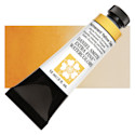

Daniel Smith – Permanent Yellow Deep, 15 ml Tube: Blick | Utrecht
Comments
5 responses to “Color Spotlight: Isoindolinone Yellow Deep (PY110)”
[…] ✓ though at the time of designing this palette, Jane recommended the old Quin Gold (PO49), which no longer exists. I’m not sure if she’d keep the hue in here. Alternatives include the components Nickel Azo Yellow (PY150) and Quin Burnt Orange (PO48); Yellow Ochre (PY42); or a deep yellow like Yellow Orange (PY110) […]
I see Holbein PY110 is on your 2025 main palette. Do you prefer it to DS? If you prefer one, would you mind sharing why? I’m curious about how they paint out as I like to avoid streakiness, and whether one wins out for appeal in mixes?
I think the choice of Holbein over DS here is probably one of my more subjective, inexplicable choices. I usually like more saturated colors, but Holbein’s is a little less so than DS. I find Holbein a bit gentler, a bit more orangey, and a bit more distinct from other warm yellows. It has a subtle bit of texture to it, and it looks good in mixes with earth colors.
All versions of PY110 I tried were streaky, so if you want to avoid streakiness, I would opt for Hansa Yellow Deep (PY65), which is a very similar hue but tends to go down more smoothly.
Thank you for your thoughtful, well-documented analysis on warm yellows. You are appreciated. God bless you.
Thank you for the detailed information on this pigment. I prefer to by single pigment tubes of color. The time you took to investigate is awesome. I want to thank you for your skill and time.