

It’s my favorite time of year: time to design my autumn palette!
Autumn Palette 2026
I always end up changing my palette midway through the season, but here’s where I am starting. I decided to opt for a larger Folio Palette this year with 15 large pans.

Top row:
- DV Arylide Yellow (PY97)
- DS Hansa Yellow Deep (PY65)
- DV Permanent Red (PR188)
- DS Quinacridone Red (PV19)
- DV Cobalt Blue (PB28)
Middle row:
- DS Nickel Azo Yellow (PY150)
- DS Transparent Orange (PO71)
- Holbein Pyrrol Rubin (PR264)
- DV Thoindigo Violet (PV19, PR88)
- WN Prussian Blue (PB27)
Bottom row:
- WN Gold Ochre (PY42)
- DS Transparent Red Oxide (PR101)
- DV Indian Red (PR101)
- DV Violet Iron Oxide (PR101)
- DS Indanthrone Blue (PB60)
Past Autumn Palettes


Past autumn palette posts:
- I designed a 2025 autumn palette but never went back to evaluate it
- 2024 autumn palette, 2024 autumn leaf studies, 2024 evaluation post
- 2023 autumn palette and 2023 problem-solving post
- 2022 autumn palette; related, Travel Sketches: Nova Scotia where I put the autumn palette to the test in October in the Halifax area
I also think of this as a personalized version of the Winslow Homer palette, because I’m planning to go to the Winslow Homer studio in Maine soon! I know he used Prussian Blue and Indian Red, and the rest of the colors are sort of guessed/revised from older version, but I know he used a lot of oranges and scarlets as well.
Common themes

For foliage, it’s important to have a bold lemon or middle yellow, primary colors for actually yellow things, and a bright orange-yellow, which is crucial for mixing oranges. I also like an earth yellow for simplicity of shadows of dry leaves.

Lots of reds. Generally, I tend to prefer a rose on the red side, such as DS Quin Red (PV19), to fill my pink/magenta mixing slot and also aid in making transparent reds with depth. This can be made redder by mixing with yellows or oranges.

I like Cobalt Blue (PB28) for crisp autumn skies as I find they are much less yellow than summer skies. Any Phthalo tends to be too yellow, including Red Shade.
Controversial takes
I had different opinions in different years about these:

Transparent Pyrrol Orange (PO71 or DPP) and Quinacridone Violet (PV19): useful for adding depth to red mixes, or surprisingly dull with annoying drying shift? This year I’m including them, they make nice red mixes

Quin Coral (PR209) or straightforward scarlet (like PR255 or PR188)? At some point I decided “PR209 mixes better oranges.” But lately I have been finding it bit too pinky-salmony. This year I’m going scarlet
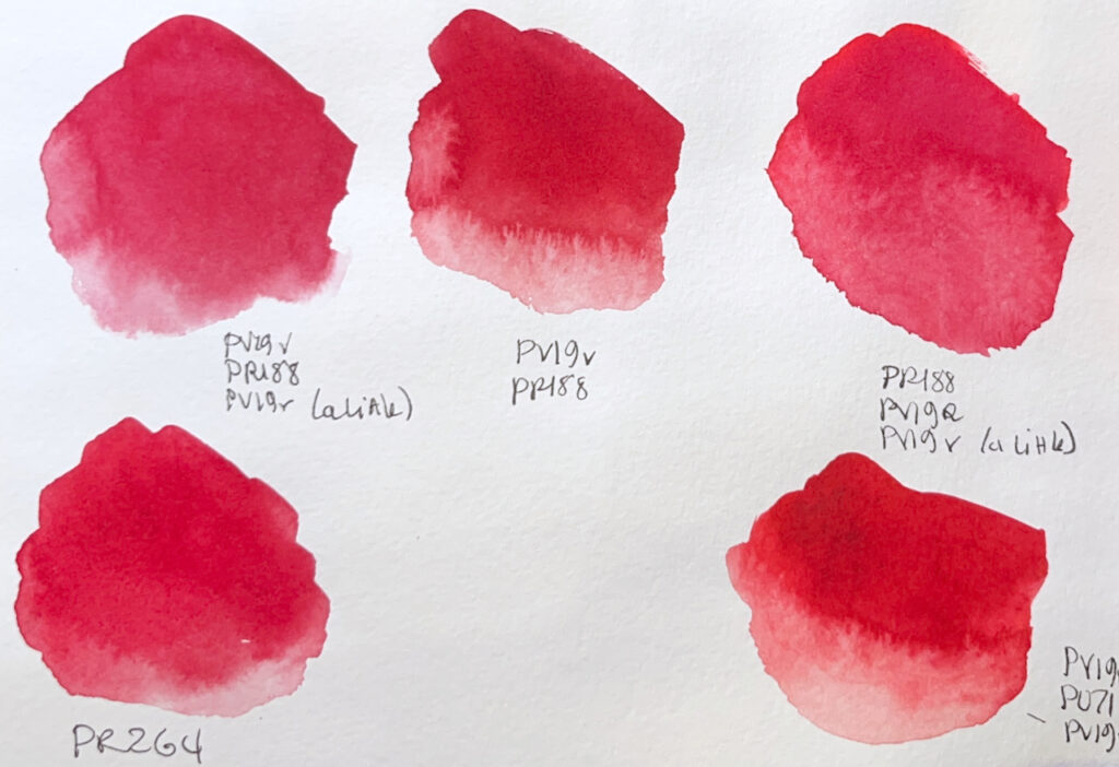
Convenience red or crimson, like Pyrrol Crimson (PR264), or unique self-mixes every time? I’m including PR264, the palette doesn’t look right without it!

Copper Azo Green Gold (PY129) or Nickel Azo Yellow (PY150) or Quin Gold? I have tended to find Quin Gold too dull in green mixes. I like PY129 better generally, but there’s something special about having a transparent glazing yellow for autumn. This year I’m going Nickel Azo Yellow.

I always end up dropping Prussian Blue, since it’s really just muted Phthalo Blue, but I’m including it this year as a tribute to Winslow Homer.
Some Favorite Autumn Mixes From This Palette
Aside from the basics you’d expect from core colors (e.g. good strong secondaries from the yellow, rose, and phthalo blue; browns from TRO + blues).
Yellow + Gold Ochre


Orange-Yellow + Scarlet


Orange + Rose


Rose & Indian Red


Violet & Scarlet

Interesting deep reds (kind of mixed crimsons) here!
Cobalt Blue + Scarlet

Muted violets!
Prussian Blue + Yellow

I like this mix for autumn yellow leaves when there’s still some green on the tree. The Prussian Blue gives a nice vivid green, but it’s more conveniently muted than the electric greens with a phthalo.

Conclusion
The trees have only barely started to turn as I write this, but I’m looking forward to painting them through October. Hopefully, I remember to write an update post at the end of the season, since those are always useful!


Leave a Reply